ShopDreamUp AI ArtDreamUp

Deviation Actions


Description
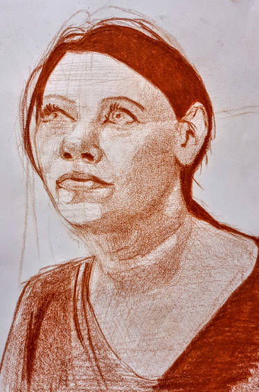
Sketch with Prismacolor verithins on canson Mi tientes paper. Same image used from my Day of the Dead image.
Image size
4961x3614px 2.31 MB
© 2011 - 2024 artbyblain
Comments12
Join the community to add your comment. Already a deviant? Log In
Beautiful !!!!